Wednesday, November 25, 2009

Lab 8: Census 2000/2010

GIS and the Census Bureau

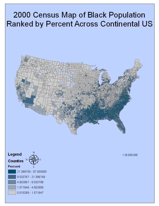
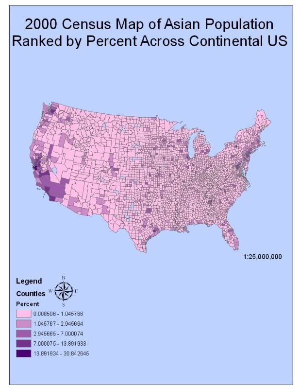
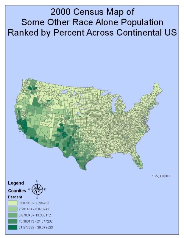
In 2000, the Census Bureau conducted their decennial survey of racial demographics in the US. In the census, Americans were given the opportunity to identify themselves with one of these racial groups: White, Black/African American, American Indian or Alaska Native (aka Native American), Asian/Asian American, Native Hawaiian or Pacific Islander, Some Other Race, Two or More Races. Below are three reference maps showing the 2000 Census populations ranked by percent of Black, Asian, and Some Other populations.

In the context of the Census Survey, Blacks or African-Americans are described as possessing origins in any of the black racial groups of Sub-Saharan Africa. Figure 1 illuminates the percentage of Black populations across the continental US. It is clear that this particular race is most prevalent in the South and in the southern regions of California. About 13.5% of Americans are Black and most are descendants of slaves during the time between 1619 and 1860s. Their history may explain the high percentages of Blacks in the southeastern region of the US because that was the primary location of slaves during the Slavery Era of the US.

In contrast, the reason why such a high percentage of Asian-Americans are found in the western regions of the US is because of the period between 1910 to 1940 (see Figure 2). During this time approximately 1 million Asian-Americans immigrated to the US through Angel Island and subsequently through San Francisco. According to the census, Asians or Asian-Americans include origins in any of the original peoples of the Far East, Southeast Asia, and the Indian Continent. Frequent specifications of these three regions involve Chinese Americans, Korean Americans, Indian Americans, Filipino Americans, Vietnamese Americans, and Japanese Americans. The Asian demographic makes up 4.4% of the US populations, equivalent to 13.1 million Americans. 4.5 million of them live in California and 512,000 Asians live in Hawaii.

Figure 3 shows the percent of the Some Other Race demographic; a non-standard category recently added to the 2000 Census Survey involving he majority of members who are typically reclassified as white in official documents. This particular category was created with the intent of capturing the two multiracial groups to which many Hispanics and Latinos belong: Meztizo and Mulatto. In the 2006 ACS survey, 6.4% of the US population belongs to this specific category (or not so specific), 97% of which were Hispanic or Latino.

Through my completion of this lab I was able to understand the value of Census data. With the information provided by the Census Bureau and my subsequent mapping of such information, one can decide where to build houses and include public facilities or one can examine the demographic characteristics of communities, states or the entire US. These analyses can help predict future demands in products, expansion locations for businesses, or nursing homes and hospitals. The skills and knowledge I obtained from this class have opened numerous doors of opportunity that will satiate the various interests I hold towards my major. After acquiring a Bachelor’s in Geography/Environmental Studies I plan on completing a Master’s Program in the field of Urban Planning. The various aspects of Urban Planning provide a cornucopia of implications that involve imperative consideration, from issues of geomorphological relationships of regions along to issues of urbanization. GIS helps organize and identify these issues. I am grateful for the opportunity I am provided in acquiring active knowledge in GIS, because I will be able to properly implement its various functions in my future studies and ultimate career.


Figure 1. 2000 Census map of Black Populations ranked by percent across the continental US

Figure 2. 2000 Census map of Asian Populations ranked by percent across the continental US

Figure 3. 2000 Census map of Some Other Race Populations ranked by percent across the continental US

Lab 7: Mapping the Station Fire in ArcGIS

Wildfires and Debris Flows

The largest fire in the recorded history of the Angeles National Forest since 1892, began on August 26th, 2009, on the hillside of Mt. Wilson. Referred as the Station Fire, it was also California’s 10th largest fire since 1933. It took over 7,400 gallons of water, burned approximately 160,577 acres, required 34 fire fighters—killing 2— and over a month and a half to completely contain this fire. However, although the Station Fire is 100% contained the forces of Mother Nature are not. Fire and vegetation loss possess tremendous influence on hill slope processes especially in debris flow events.

Commonly described as mudslides, debris flows are common types of fast-moving landslides that typically occur during prolonged rainy events. As precipitation rates exceed the rate of ground infiltration, the excess runoff strips away sediment from hillsides, carries them into the channels and transports them into the lower basins. However, in areas where fires have occurred the chaparral is de-rooted and denuded adding considerably more debris. Because of its increased volume, the debris can no longer be carried away by streams but, now, has enough strength to slide directly down the slope increasing in power.

Debris flows may consist of simply water and silt and clay particles, or of rocky mud carrying trees, boulders and cars. Once the flow hits an even slope, the flow may accumulate into thick deposits extending in a large diameter. This can be both costly and deadly in developed communities. On a national level debris flows are responsible for at least 25 to 50 deaths and 2 billion dollars in clean up annually. Therefore, in the context of the recent Station Fire it is imperative to understand the various factors that trigger debris flow and what their roles are in the event of a landslide.

The factors that influence the occurrence of debris flows are rainfall, slopes, vegetation and wildfire. The center of the fire located at Mt Wilson extends across the San Gabriel Mountains, and makes it very likely for the location of the Station fire to experience debris flow events in the coming winter months (see Fig 1). Southern California possesses a Mediterranean climate that is described by dry summers and wet winters. As little as 7mm of rainfall in a time span of half an hour can trigger debris flow in Southern California. Furthermore, the USGS states that, “any storm that has intensities greater than 10mm per hour (0.4 inches/hour) is at risk of producing debris flow. Temperatures in the San Gabriel Mountains range from an average of 50 degrees Fahrenheit in the winter to an average of 70 degrees Fahrenheit in the summer. The driest month of the year tends to be in July with an average of 0.03 inches of rain and the wettest month of the year is typically February averaging about 4.66 inches of rain.

The major peaks of the San Gabriel Mountains range from 3,207 feet to 10,064 feet. These peaks are accompanied by steep slope angles that speed the momentum of the downward flow of water. The amount of debris transported depends on the speed of the water flow; the faster the flow the more debris it can pick up. Runoff and erosion accelerate because of wildfire events. Infiltration capacity of soils decreases as a result of fire. Prolonged heavy rains increase soil moisture. The saturated soil may fail, causing an infiltration triggered landslide. This occurrence is common up to two years after a wildfire event. The extreme heat of the wildfire creates a soil condition in which no water can be absorbed and instead accumulates a waxy-like layer just below the ground surface.

Works Cited
"Debris flows." Earth Science Australia. Web. 24 Nov. 2009.
http://earthsci.org/flooding/unit3/u3-03-04.html.
"Fires.....closures?" California Predators Club Forums. Web. 23 Nov. 2009.
http://www.californiapredatorsclub.com/lofiversion/index.php?t15355.html.
"Forestry - Fire Weather/Danger - Terms and Explanation." Los Angeles County Fire Department. Web. 24 Nov. 2009.
http://www.fire.lacounty.gov/forestry/FireWeatherDangerTerms.asp.
"InciWeb the Incident Information System: Station Fire." InciWeb the Incident Information System: Current Incidents. Web. 23 Nov. 2009.
http://www.inciweb.org/incident/1856/.
"Landslide and Debris Flow (Mudslide)." The Disaster Center - Home Page. Web. 23 Nov. 2009. http://www.disastercenter.com/guide/landslide.html.
"Recent Publications." Landslide Hazards Program. Web. 24 Nov. 2009. http://landslides.usgs.gov/learning/publications.php?project_id=6#factsheets.
"San Bernardino National Forest - Welcome!" US Forest Service - Caring for the land and serving people. Web. 23 Nov. 2009.
http://www.fs.fed.us/r5/sanbernardino/.
"San Gabriel Weather | San Gabriel CA." IDcide - Local Information Data Server. Web. 23 Nov. 2009. http://www.idcide.com/weather/ca/san-gabriel.htm.
"Station Fire Over La Ca." CBS 2 - KCAL 9 - Los Angeles - Southern California - LA Breaking News, Weather, Traffic, Sports. Web. 24 Nov. 2009. http://cbs2.com/local/Fire.Watch.Angeles.2.1152524.html.
"West Covina Website - Section 7: Earth Movement (Landslide / Debris Flow)." West Covina Website - Homepage. Web. 23 Nov. 2009.
http://www.westcovina.org/cityhall/fire/prepare/nhmp/7.asp.
"WRD: 2002-2003 Hydrologic Report." Dpw.lacounty.gov. Web. 24 Nov. 2009. http://ladpw.org/wrd/report/0203/laco.cfm.

Wednesday, November 11, 2009

Lab 6: DEMs in ArcGIS

Lake Tahoe


Figure 1. Shaded Relief Model of Lake Tahoe


Figure 2. Slope Map of Lake Tahoe


Figure 3. Aspect Map of Lake Tahoe


Figure 4. 3D Elevation Model of Lake Tahoe


For the DEM lab this week, I chose to create a digital elevation model of Lake Tahoe. Geologic block faulting created the lake basin approximately 2 to 3 million years ago. Lake Tahoe’s surface elevation is about 6,225 feet above sea level. Surrounding the lake by the Sierra Nevadas (to the west) and the Carson Range (to the east), the mountains’ peaks rise more than 10,000 feet above sea level. Positioned right in between California and Nevada (39.36°N, -120.39°W, 38.84°S, -119.63°E), Lake Tahoe is a common vacation ground for many Californians. I know this because many of the friends that I made while attending UCLA and my friends back in my hometown in Mission Viejo spend many weekends swimming, jetskiing, and camping at this location. I, for one, never visited Lake Tahoe and feel very left out when my friends share their cherished memories. As a result, I decided that creating a DEM in GIS will satiate the curiosity I hold towards this common vacation spot…At least I will be able to interject future conversations regarding this topic with, “Did you know I created a Digital Elevation Model of Lake Tahoe that used the North American Geographic Coordinate System of 1983?” That’ll show ‘em.


Lab 5: Projections in ArcGIS


Figure 1. Equal Area Map Projections. Distance between Washington D.C. and Kabul is included in figure


Figure 2. Equidistant Map Projections. Distance between Washington D.C. and Kabul is included in figure.


Figure 3. Conformal Map Projections. Distance between Washington D.C. and Kabul is included in figure.


Not everything that counts can be counted, and not everything that can be counted counts.
-Albert Einstein

Map projections endeavor to portray the Earth on a flat surface. Inevitable distortions accompany these attempts involving deviations in distance, direction, scale, and area. The Projections in ArcGIS Lab focused on three types of map projections: equal area, equidistant, and conformal. By creating maps through the use of ArcMap, I realized the significance, perils, and potential of each type of projection.

The first type of projection I included in this blog is the equal area projection. Map projections of equal area possess the same proportional relationship to the represented areas on the Earth. Within this category I chose to illustrate the world through cylindrical equal area and Mollweide map projections (Figure 1). Cylindrical equal area maps exemplify the method of a normal perspective onto a cylinder with points intersecting at the equator. The Mollweide projection encapsulates a pseudo cylindrical equal area projection method, in that all the parallels and the central meridian are straight lines and meridians (with the exception of the central meridian) are elliptical arcs. The shape of the cylindrical equal area map projection stays true along the standard parallels and increases in distortion towards the poles. In the Mollweide projection the shape stays true at the intersection of the central meridian and latitudes 40˚ 44’ North and South with distortion also increasing outwards from the intersection towards the poles. The direction and distance behave in the same way for both cylindrical equal area and Mollweide map projection where the accuracy diminishes as measurements are taken farther from the standard parallels for the cylindrical equal area and at the aforementioned intersection for Mollweide. Equatorial regions possess the greatest benefit in the application of cylindrical equal area map projections since it is a narrow area extending along the central line. This particular projection suffers a limitation of severe distortion near the poles. The Mollweide map projection plays a useful role in thematic or distributive mapping of the world, but is only useful as a world map. Goode’s Homolosine and Boggs used a combination of Mollweide and Sinusoidal map projections.

The second type of projection, included in today’s blog is the equidistant map projection. Defining a map as an equidistant projection involves a portrayal of distances from the center of the projection to any other place on the map. Constant scale is preserved along all great circles from one or two points. Figure 2 shows a map with an equidistant cylinder projection and a map with an equidistant conic projection. The construction of an equidistant cylinder projection entails a conversion of the globe into a Cartesian grid where every rectangle possesses the same size, shape and area. The equidistant conic projection has the option of being based on one or two standard parallels. Graticules are evenly spaced with the representation of poles as arcs instead of points. In both projections shape and area distortion increases as distance from the standard parallel increases. Furthermore, accuracy in direction locally along the standard parallels is observed in cylindrical and conic map projections. The equidistant map projection achieves its maximum potential when used in city maps or used as a simple portrayal of regions with minimal geographic data. Index maps emphasize the usefulness of this specific projection. When using conic map projections range in latitude should be limited to 30˚, thus making it useful in regional mapping of mid-latitude areas extending predominantly east and west. Atlas maps of small countries commonly use conic map projections, although it was used by the former Soviet Union in mapping the entire country.

The final map projection type, as shown in Figure 3, is the conformal map projection. Used primarily for navigational purposes conformal maps contain parallels and meridians that intersect at right angles. Across the map lies a constant scale while preserving local shapes and angles. The original intent of the Mercator projection was to display accurate compass bearings for sea travel. Since this projection maintains local angular relationships, small shapes are well represented. The area and direction result from the fact that any straight line drawn on this projection represents an actual compass bearing. As mentioned, navigational and directional functions, like air travel, wind direction, and ocean currents depend on the Mercator projection. However its best use applies to equatorial regions or, regions near the equator, like parts of the Pacific Ocean or Indonesia.

Although it is included under the conformal map projection category, the Gall Stereographic map projection is, in fact, not exactly a conformal map projection. It is included because stereographic maps are typically conformal in that they conserve the shape of circles in addition to conserving perspective. The reason that the Gall Stereographic map projection is not a conformal map is because it projects the world on a cylinder with two standard parallels at latitudes 45˚ North and South. The shape, among other properties, such as direction, distance and area, is only conserved at these latitudes with distortion increasing towards the poles. British atlases employ the Gall Stereographic however its application strictly limits itself to world maps.

Wednesday, November 4, 2009

Lab 4: Intro to ArcMap

Following the ArcMap tutorial was very easy. If I did not understand the directions, there were also clear visual representations of the actions I am required to do. Although I needed to be guided in order to see the different facets ArcMap had to provide, I felt like a lot of my time was spent with ArcMap essentially holding my hand, rather than letting me discover thing independently. However, following directions got me out of a lot of trouble except when I had issues with exporting and importing files.

Admittedly, I know I am mostly responsible for this problem, but the first time I completed the task I did not have a flash drive to save everything; I was working off the C drive present on the computer. My second attempt introduced the availability of a flash drive to save my work. This introduction made me realize that I should not only avoid depending on the S drive but also the C drive. Although I had all of the files transferring back and forth between the S and C drive, I did not have all of the files that existed in the S drive copied onto my C drive. This became an issue when I had to incorporate files from ArcCatalog into one of my maps. I was not able to edit or alter my attributes table in the tracts layer of my map. Since I assumed that all the answers were found in the ArcMap Tutorial, I felt like my dependency on the tutorial played a role in this particular frustration.

As a novice to GIS, I am not sure as to whether or not these 5 exercises were too much or just the right amount as an introduction to GIS. The reason for my uncertainty is mostly based off a need for more time spent discovering and personally “connecting” with the ArcMap application combined with the awareness that this is a 10 week course. As a student who attemped this lab 3 times, I still focused more on not straying away or clicking the wrong button for fear of losing all that I acquired and the consequence of redoing the exercise all over again. I confess that I now know where to go to place a legend into my map or how to change the symbols depicted on the map, but I want to know the bigger picture. I wish my exercise helped me independently think of a solution to a problem rather than giving me the step by step direction regarding the construction of a road between an airport zone and school zone that is within the noise contour.

Perhaps I am overanxious and as a result I am oversimplifying the complexities of ArcMap. One thing I am afraid of is the necessary awareness in the conversion of map layers into the same units. I wish considerations such as keeping like units would be accounted for in the ArcMap software. This sort of technical awareness can be comparable to spell check on Microsoft Word. The underlining of the misspelled word helps the author realize his typo.

I also wish there was more time spent in explaining what the purpose of all the different things ArcMap told me to do. Why the editing tool is so useful in various aspects of map making and layering. Though I know the potential of this software will be realized the more I use it. Nevertheless, I never understood how much power a map maker REALLY has until I started using ArcMap. A message can be manipulated through histograms and graphs of map that can be viewed at any scale layered with any road system, school system etc that can all be derived from ArcMap.

Wednesday, October 21, 2009

Lab 3: Neogeography

Miles of My Meals

As a college student, grocery shopping plays an integral part in my life. I have noticed that I tend to consistently eat the same thing for lunch. I eat a turkey sandwich with chips and a glass of oj. I realized that the different foods that comprise my invariable lunch meal are distributed from various places. As a result of this realization I've decided to map the distance between the location where I buy my groceries (Ralphs off Le Conte in Westwood) and places where these foods are distributed. The purpose of this map is to remind myself and other fellow consumers of the distances our meals travel before they even reach the grocery store in order to finally end up in our stomachs. It is important to keep in mind that the location from which the food is distributed is not always the place where the food is grown or produced. However, if one highlights over certain points on the map he or she may find a brief overview of the food's original place of production.


View Miles of My Meals in a larger map

One of my critiques on the My Maps application on Google Maps is the fact that for the sake of this particular map idea I feel limited to only plotting distribution locations of the components of my lunch. I wish I could show the various places and distances travelled starting from the production of the food items to processing to packaging and finally to distributing these entities to their final destination--the grocery store. Yet, plotting these points for each food item makes for a very disorganized visual representation and the message I am trying to make becomes lost in scattered dots. Furthermore, My Maps does not provide much freedom in the topographical visualization of the map nor does it give much freedom in the way my points are labeled.

Nonetheless, I believe the My Maps works as a good application for basic geographical presentations and a good starting point for those presentations that are more complex. I enjoyed the fact that I was able to Google Map something and thoughtlessly add the particular landmark to My Maps, thus, making the map constructing process quick and almost painless. I also appreciated the tutorial Youtube video Google provided for My Maps. This tutorial introduces an opportunity to provide any Internet user the potential to create a Google Map. The map’s generation will not only convey a message the creator aimed to make but it will add to the information database of the Google search engine making this message available to otherwise intangible audiences. This potentially generates yet another form of communication between people around the world and, thus, adding more gravity and more realization of topics these generated maps discuss.

When depicting messages and images on a map one is not merely telling the audience something; one is actively showing them. As the famous saying goes, “Tell me and I’ll forget; Show me and I may remember, Involve me and I’ll understand.” Because of my involvement in actively attempting to find out the distribution points and production sites of all the components that make up my daily lunch meal I now realize the power I hold in where I buy my products. Grocery stores that buy their food locally are less harmful to the environment and more often than not possess safer and healthier foods. The fact that it was so difficult to even find out where half of my items were produced brang nausea to my stomach and hopefully this map may bring about the same bizarre realizations and curiosities in consumption that I now possess.

Monday, October 12, 2009

Lab 2: USGS Topographic Maps

Analysis of 7.5 Minute Map of Beverly Hills

1. What is the name of the quadrangle?

a. The name of the quadrangle is “Beverly Hills Quadrangle” which is located in Los Angeles, California.

2. What are the names of the adjacent quadrangles?

a. The names of the adjacent quadrangles are: Canoga Park (1), Van Nuys (2), Burbank (3), Topanga (4), Hollywood (5), Venice (7), Inglewood (8).

3. When was the quadrangle first created?

a. The quadrangle was first created in 1995.

4. What datum was used to create your map?

a. The datum used to create this map was the National Geodetic Vertical Datum of 1927 and the North American Datum of 1983.

5. What is the scale of the map?

a. The scale of the map is 1:24,000

6. At the above scale, answer the following:

a. 5 centimeters on the map is equivalent to how many meters on the ground?

i. RF = map/ground = 0.5 cm X 1/24,000 X 1m/100cm = 1200 meters

b. 5 inches on the map is equivalent to how many miles on the ground?

i. RF= map/ground = 1(5in)/24,000(5in)à 5in:120,000inà120,000in/63,360in = 1.89 miles

c. One mile on the ground is equivalent to how many inches on the map?

i. RF=map/ground = 63,360in/1mile X 1/24,000 = 2.64in

d. Three kilometers on the ground is equivalent to how many centimeters on the map?

i. RF= map/ground = 3km X 100,000cm/1km X 1/24,000= 12.5cm

7. What is the contour interval on your map?

a. The contour interval on my map is 20 feet.

8. What are the approximate geographic coordinates in both degrees/minutes/seconds and decimal degrees of:

a. The Public Affairs Building;

DD: 34.07°N, -118.43°W;

D/M/S: 34°04’12”N, -118°25’48”W

b. The tip of Santa Monica pier;

DD: 34.00°N, -118.50°W;

D/M/S: 34°0’28”N, -118°30’60”

c. The Upper Franklin Canyon Reservoir;

DD: 34.12°N, -118.41°W;

D/M/S: 34°7’12”N, -118°24’36”W

9. What is the approximate elevation in both feet and meters of:

a. Greystone Mansion (in Greystone Park);

570 ft; 170.736m

b. Woodlawn Cemetery;

140ft; 42.672m

c. Crestwood Hills Park

660ft; 201.17m

10. What is the UTM zone of the map?

a. The UTM zone of the map is zone 11.

11. What are the UTM coordinates for the lower left corner of your map?

a. The UTM coordinates for the lower left corner of my map are 3763000 northing and 362000 easting.

12. How many square meters are contained within each cell (square) of the UTM gridlines?

a. 1,000,000 square meters are contained within each cell of UTM gridlines.

13. Obtain elevation measurements, from west to east along the UTM northing 3771000, where the easting of the UTM grid intersect the northing. Create an elevation profile using these measurements in Excel (hint: create a line chart). Figure out how to label the elevation values to the two measurements on campus. Insert your elevation profile as a graphic in your blog.

a.

Figure 1. Elevation profile from west to east along the UTM northing 377100, where the eating of the UTM grid intersect the northing. The points that have a yellow border are the two measurements that include the UCLA campus.

What is the magnetic declination of the map?

a. The magnetic declination is 14°

15. In which direction does water flow in the intermittent stream between the 405 freeway and Stone Canyon Reservoir?

a. The water in the intermittent stream between 405 freeway and Stone Canyon Reservoir is flowing in the North to South direction.

16. Crop out (ie. Cut and paste) UCLA from the map and include it as a graphic on your blog.


Figure 2. Graphic of UCLA cropped from the 7.5 minute Beverly Hills Quadrangle.

df


fd


Wednesday, September 30, 2009

Lab 1: SSC, SOD Survey & A Blog

Suspended in A Sunbeam


The Earth is a very small stage in a vast cosmic arena. Think of the rivers of blood spilled by all those generals and emperors so that, in glory and triumph, they could become the momentary masters of a fraction of a dot. Think of the endless cruelties visited by the inhabitants of one corner of this pixel on the scarcely distinguishable inhabitants of some other corner, how frequent their misunderstandings, how eager they are to kill one another, how fervent their hatreds. (Carl Sagan, May 11 1996)
No matter how much one tries to enlarge this photo, or how much one attempts to zoom in, the arrow will still be pointing at a "Pale, Blue Dot." This dot should certainly not be overlooked for it is the home of every plant and animal known to exist. This dot is Earth. The robotic space probe named Voyager 1 captured this image commonly referred to as "Pale, Blue Dot" in 1990 from a record distance of 3.7 billion miles. According to Nasa, the Earth takes up about 0.12 pixels of the entire picture. This particular photograph is part of a 60 image mosaic project intended to create a family portrait of the solar system that includes Earth. I believe this image holds great geographic significance because it reveals all that we know and all that we take for granted in a spatial context. It also possesses a great deal of analysis when involving the five various types of Geographic Questions. Applying those questions on a personal level this image helped me appreciate the opportunity and privilege of my attendance at a location like UCLA, my associations with the diverse people that possess diverse beliefs, and my intentions that I hold in my interactions with people. It helped me put my life and my purpose in perspective and it also solidified the curiosity I hold with geography and GIS. Carl Sagan said it best, "Like it or not, for the moment the Earth is where we make our stand."


San Francisco, San Francisco,
You Muttering Bum in a Brown Beat Suit


This is a "lit map" of San Francisco. It contains several literary artists from various cultural and countercultural movements, including the "Beat Generation," whose works are heavily associated with this city. The distribution of quotes on this particular map correlates with the quotes' reference t the location. For example, in the upper left side of the map there is a quote boxed in green that says, "The dance and the debutante met on the sly, Finding secluded spots in the new Golden Gate Park to kiss and grope, The nearby bison grumbling in their corrals." This quote, by Andrew Sean Greer, is intentionally placed within the borders of the green backround because that section is the location and extent of Golden Gate Park. I found this map very intriguing because virtually all of the quotations observed on this map display the poetic interaction these artists experienced with the area they described.


"If Geography is Prose, Maps are Iconography"
-Lennart Meri

http://yoga108.org/images/blog/2007/383.jpg,

Although I'm sure that this map was not intended to be pulled down from a whiteboard during a geography lesson in a grade school classroom, it still possesses some educational value. This map can be viewed politically; one may argue it depicts a Texan's ignorant view of the US. I also chose this conspicuously distorted map because it emphasizes the significance and the power a cartographer holds when constructing a map. It reminds me of the various names given to different countries, like Persia/Iran and Burma/Myanmar, that involve historical power struggles, which were, or still are, tied to what certain people prefer to call them. The preference is rooted in a righteous audacity and has an influential power that is commonly and heavily underestimated. Thus, why I believe it is important to be weary of such power and influence that is ranked in the study and the application of Geography and GIS.

About Me

Followers